Brand Identity & Web Design
Tenon
Brand identity for Tenon, an AI platform that fits managed AI workflows into how a business already works. One idea, the woodworking joint, carried through a concept, a lettermark, a brand guide, and a production website.
The concept
Every AI platform looks the same. Tenon starts from fit.
Tenon helps mid-sized companies get real results from AI by mapping how their business actually works and building managed AI workflows on top. The category default is cold blues, robot illustrations, and dashboards floating in dark voids. Tenon's promise is craftsmanship, because the platform comes with the team who builds it in, so the identity had to feel precise and warm at once.
The concept came out of the name. A tenon is the tongue of wood cut to fit exactly into its mortise, and the joint holds through precision of fit rather than force or fasteners. That one idea became the whole brand: navy structure, cobalt current, one ember point of fit, calm surfaces, exact alignment, nothing bolted on.
The mark
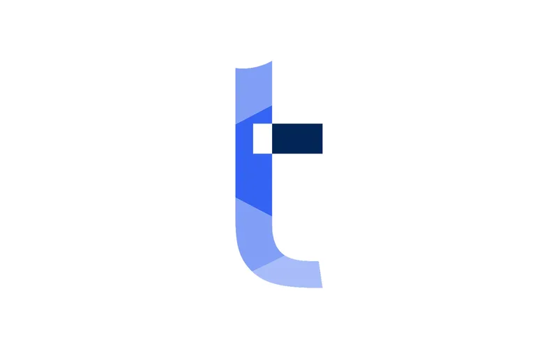
A lowercase t, cut like its namesake joint
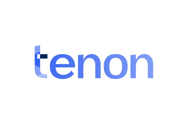
The lettermark makes the name literal. The lowercase t is color-blocked in navy and cobalt with a notch knocked out at the joint, so the letter itself is a tenon: two parts holding because they were cut to fit. Clearspace, minimum size, and the misuse rules are all measured in notch widths, because the notch is the one detail the mark can never lose.
The metaphor scales from the mark to the company. Tenon fits AI into how a business already works, joining knowledge, processes, systems, and permissions into one structure that holds because everything is cut to fit. The logo is that promise at its smallest size.
The guide
A full fledged design system
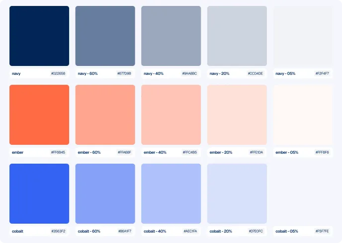
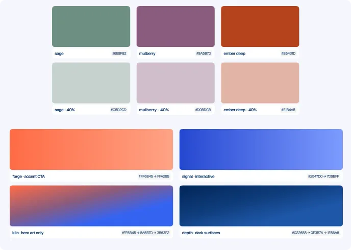
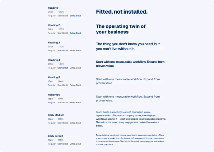
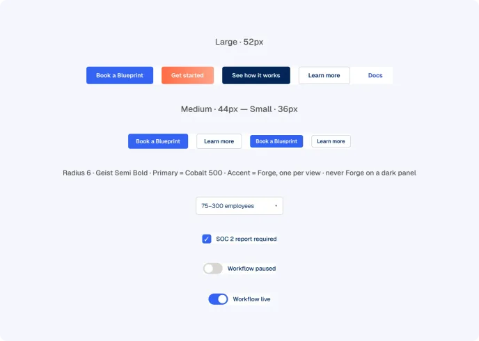
The brand shipped as a finalized guide: the logo system, a six-family color architecture where every tint is its own hex, type roles for Inter and Clash Display, and four gradients with exactly one job each. The ember accent lives on a measured budget of 8 to 10 percent of any screenful, in small sharp pops, never washes.
Every value is final and every rule is enforceable, so any future designer produces on-brand output from the guide alone. It is not a moodboard; it is the working source of truth for the site, the product UI, and the sales material.
The website
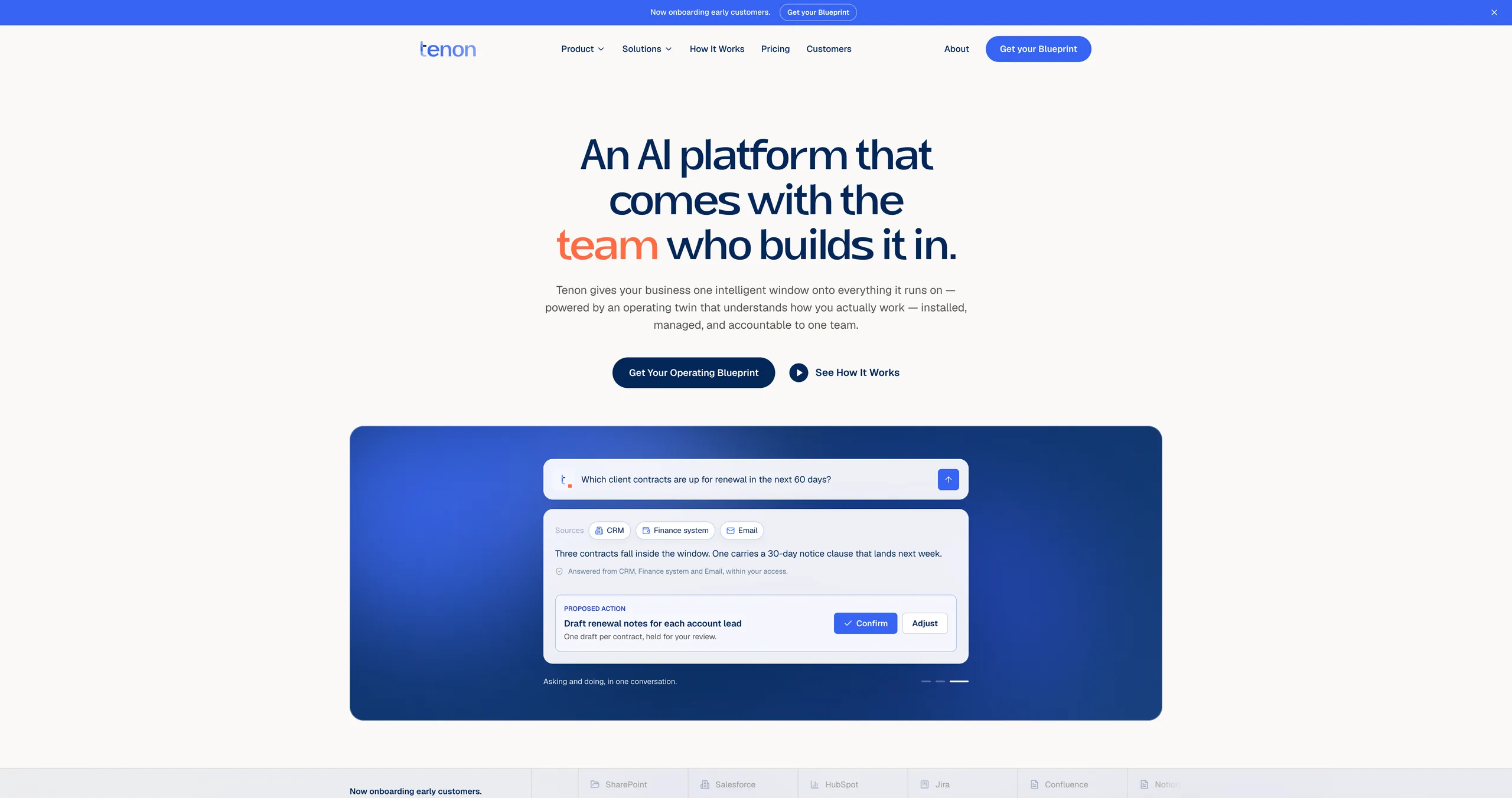
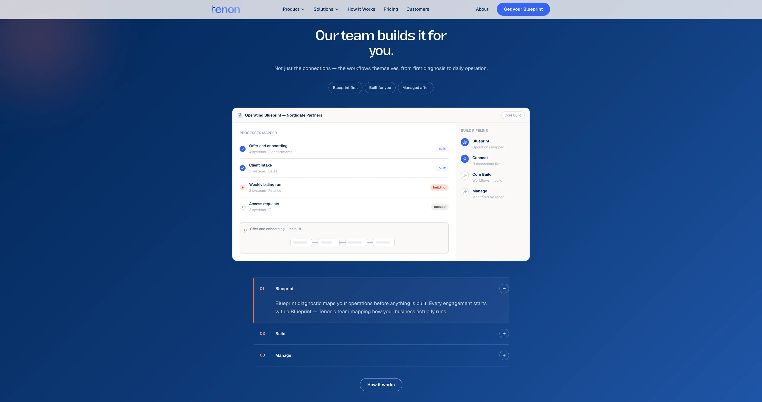
The system applied to a real website
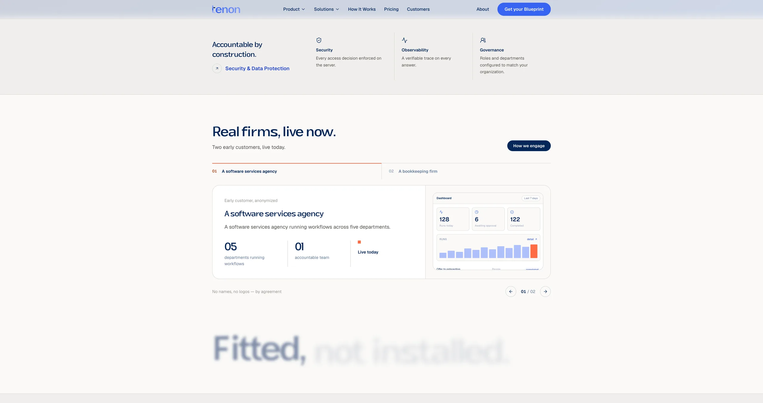
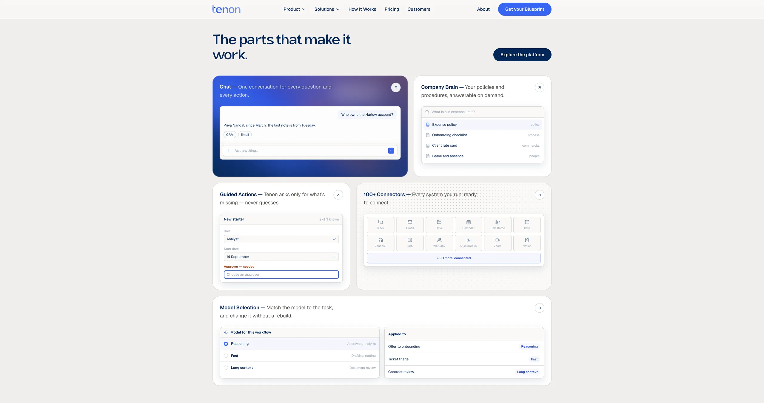
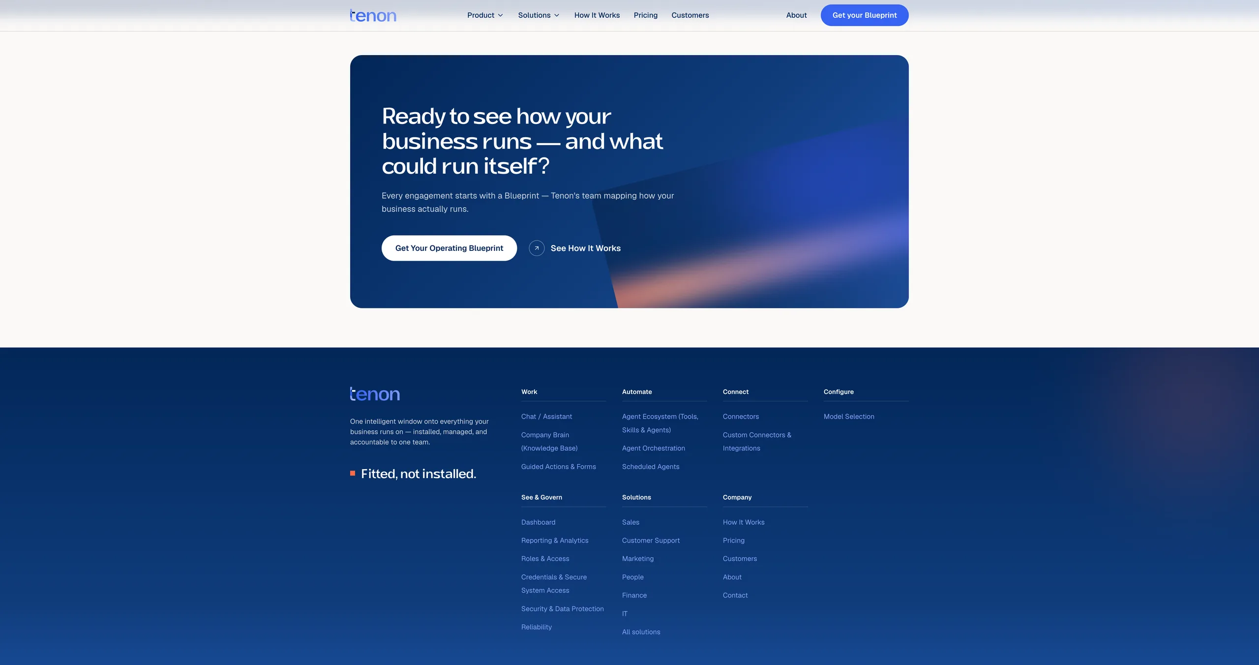
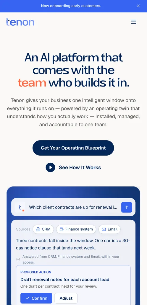
The marketing site is the guide made real: a ten-section Next.js home where a Kiln glow carries the hero, ember appears on budget, and every dark surface sits on Depth. Built and shipped to production.
Pebble